
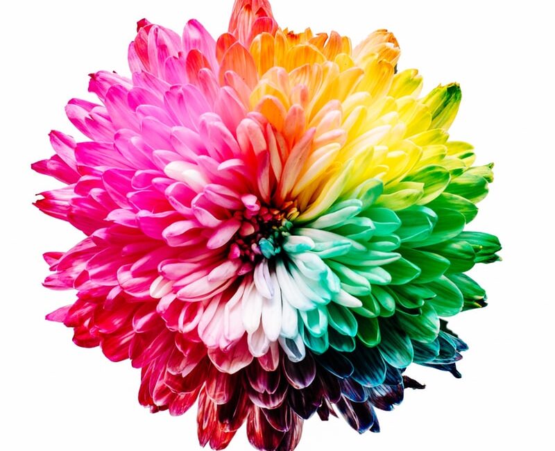
The Color Effect
")
“I spy with my little eye something… blue!”
Not only was color the core of the only game that got you through all those childhood road trips, but its importance is especially evident in a branding or website project because color affects the way people feel.
Color is everywhere (literally) and that is what makes it so powerful. Colors are so ingrained in our daily lives that certain feelings, ideas, or connotations are naturally connected to different colors. Yet, while there are universal color associations based on studies and research, the concept of color and emotions ultimately depends on the individual. Particularly, colors are greatly impacted by culture and personal attachment.
For example, in most western cultures, white is associated with purity while in most Asian countries white is correlated to mourning. This demonstrates the importance of researching and learning about your audience to ensure your brand or website colors portray the intended meaning.

Powerful Colors Can Increase User Engagement
When building a brand or website, the designer uses techniques called user experience (UX) and user interface (UI) design. The purpose of UX and UI is to create a design that is functional and prompts a response. And of course, to do this, it requires strategic color use and placement.
Color is often the first thing someone sees when looking at a logo or viewing a website and from a quick glance, the viewer has already had an emotional response to the visual content, whether they are aware of it or not. The psychological effect of color on human behavior can greatly impact how a user responds both emotionally (e.g. attracted to the brand) and physically (e.g. clicks a button). This response is what the designer wants to control.

A Breakdown of How Color Affects the Way People Feel
Color Groupings
First, there are three color groupings/levels:
Primary Colors
Primary are the colors that cannot be created by mixing other colors, they are red, yellow and blue.
Secondary Colors
Secondary colors are the ones that can be created by mixing the primary colors.
Tertiary colors
And as you guessed, tertiary colors are all the other colors created by mixing the secondary colors.
That’s a lot of colors! Which means there are tons of variations, shades, hues, etc. of a color that invokes a wide range of feelings. In addition, when different colors are combined, this can cause a shift in emotions. For now, we will just explain the three color families: warm colors, cool colors, and neutral colors.

Warm Colors: Reds, Oranges, and Yellows
Red
Red draws attention with suggestions of warning or anger, such as a stop sign. It also represents strength and importance, like the red carpet.
Orange
Orange is warming and fun, like the leaves during Autumn, and cause emotions such as energy and friendliness.
Yellow
Yellow is bold which can be used to indicate caution, just like crime scene caution tape, but also has a more positive side with emotions of optimism, creativity, and enthusiasm just like the sun.

Cool Colors: Greens, Blues, and Purples
Green
Green has a calming feature of health, growth, and prosperity, often representative with nature. On the opposite side, it can cause feelings of envy or sickness, like dollar bills.
Blue
Blue is a popular color used as a sign of loyalty, logic, and serenity, for example, an open lake. It also gives a sense of coldness or uncaring shown in its common association with winter.
Purple
Purple has values of luxury, wisdom, and wealth stemming from the purple clothing worn by royalty.

Neutral Colors: Black, White, Grey, and Brown
Black
Black is prominent with meanings ranging from elegant and powerful, like a suit, to mournful and mysterious, like the night time.
White
White prompts purity, innocence or cleanliness, demonstrated in the phrase “white as snow.” It also can be used to offer sharpness or professionalism as a new white button-up top does.
Grey
Grey is a balanced color with less emotional appeal compared to the other colors and can be used to show both strength and weakness because of its subtleness.
Brown
Brown is an earthy color with a sense of stability, reliability or wholesomeness, like a log cabin. On the flip side, this shows dirtiness, heaviness, or sadness, for example, a muddy pond.
What colors are best for your business?
These descriptions just summarize the extensive research on the psychological effects of color and how emotional design requires the use of strategic color.
When developing website colors or deciding on the best brand colors, understanding the psychological effects of color on human behavior is significant in order to accurately portray the emotion and idea you want your company and its branding to represent.
Something as prevalent as color requires careful and strategic planning when creating a logo, choosing brand colors or designing a website. The design team at Evolve Systems® spends extra time researching, presenting, and creating a design palette perfect for your company.
Get in touch and check out what colors they have up their sleeves for you!