
What is light mode? What is dark mode?
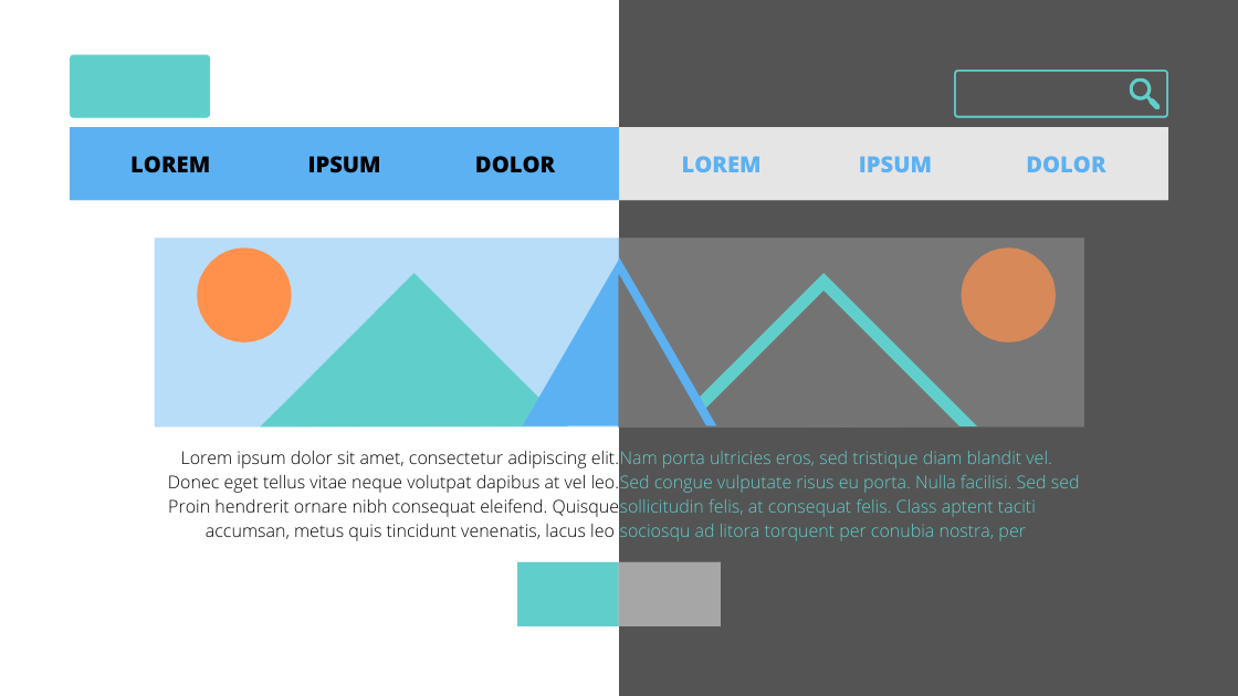
Light mode, otherwise referred to as positive contrast polarity is when dark text is displayed on top of a light background.
Dark mode, otherwise called negative contract polarity is when lighter text is displayed on top of a darker background.
Dark mode experiened a major shift in popularity once Apple released the dark mode feature with the new IOS update in September 2019. While there is no denying dark mode looks simply cool, in the world of website design it alters the process and best practices. Besides, the entire display has changed so it is safe to assume the design process would be significantly affected by the transformation.
The following sections address dark mode’s dos and don’ts and a few tips when designing a website for dark mode.
How Dark Mode Can Enhance Your Website

Element Prominence
The dark background compels visual content to pop because the elements are displayed against the deep background. This causes them to stand out more than if the elements were displayed against a light or white background. This, in addition, adds to the visual hierarchy of elements.
Intensifies Emotions
With the increased use of negative space paired with high-contrast elements, dark mode can create a much more powerful emotional design. Dark mode gives the website the opportunity to intensify emotional responses by placing text, content, or elements to appear more prominent against the deep background. This heightens colors’ already existing appeal to emotions. Click here to learn more about how color affects emotions.
Improves Usability
A primary favorable component of dark mode is how it minimizes eye strain when used in a darker environment, for example at night. A lot of businesses whose services have a large nighttime use have implemented dark mode. For example, Netflix and Prime Video use a dark theme since their applilations are heavily used during nighttime; therefore by reducing eye strain, it increases the usability of the service Other businesses have implemented a toggle feature that switched from a light mode to dark mode based on the perceived environment, such as Google Maps will automatically switch to a dark mode when used at night.
How Dark Mode can Hinder Your Website

Limits Text
Dark mode causes our pupils to dilate, or increase in size, in order to focus on the design which in response reduces the sharpness of the design elements. Therefore, it can cause blurriness or halation, when halos appear around the lighter text on darker backgrounds, which diminishes the quality of the design. This has a significant impact on text-heavy designs because the more white text on a dark background there is, the more blurry the page will appear ultimately limiting legibility.
Limits Content Variety
Since dark mode requires more negative space in order to not seem cluttered, if a site requires a lot of content (images, dropdowns, buttons, videos, etc.), the page will quickly become too full. Similar to the text-heavy designs, dark mode works significantly better for simpler designs; those with more text or content are better displayed with light mode.
Limits Color Use
While dark mode can emphasize emotional response through color enhancement, it also restricts what colors work well with the design. Too many bright colors can quickly cause the design to be overbearing against the dark background because of the stark contrast. Therefore muted colors should represent most of the design’s elements and texts with a few impacts of bright colors.
Dark Mode Design Tips

Use of “White” Space
With dark mode, the design naturally looks more full and heavy. Therefore in order for the design to appear organized and have appropriate structured content, the use of white space, or rather “dark” space, will need to be carefully constructed to offset the density of dark mode.
Black vs Dark
Dark mode does not mean it needs to have a pure black design, in fact, pure black causes such a high-contrast that it can be difficult to look at. Instead, a dark gray background lessens the contrast while still aligning with a dark mode design. In addition, gray has many shades allowing designs to express elevation and depth through shadows.
Present Depth
To effectively communicate through design it needs to express the hierarchy of elements. In dark mode, the use of elevation demonstrates how the elements should be viewed. As mentioned above, the use of shadows with lighter surfaces is used to construct that necessary elevation.
Maintain Brand Colors
While dark mode limits the use of color options, the design still needs to reflect your branding colors. Instead of displaying your colors on the dominant portion of the page, try using the brand colors as accent pieces so your brand is still recognizable while aligning with the dark mode’s best practices.
Offer Light and Dark Mode
Yet the best dark mode design is to also offer light mode so the user can choose or switch between the two. While the default design could be dark mode, the user should have the ability to switch to light mode which ensures the viewer has a positive user experience based on their individual preferences.
From the viewer’s perspective, they may choose dark mode simply because it looks “cool.” Yet from the website designers viewpoint, dark mode offers a new and creative way to display your website to engage with the audience. And of course, keeping your website looking “cool.”